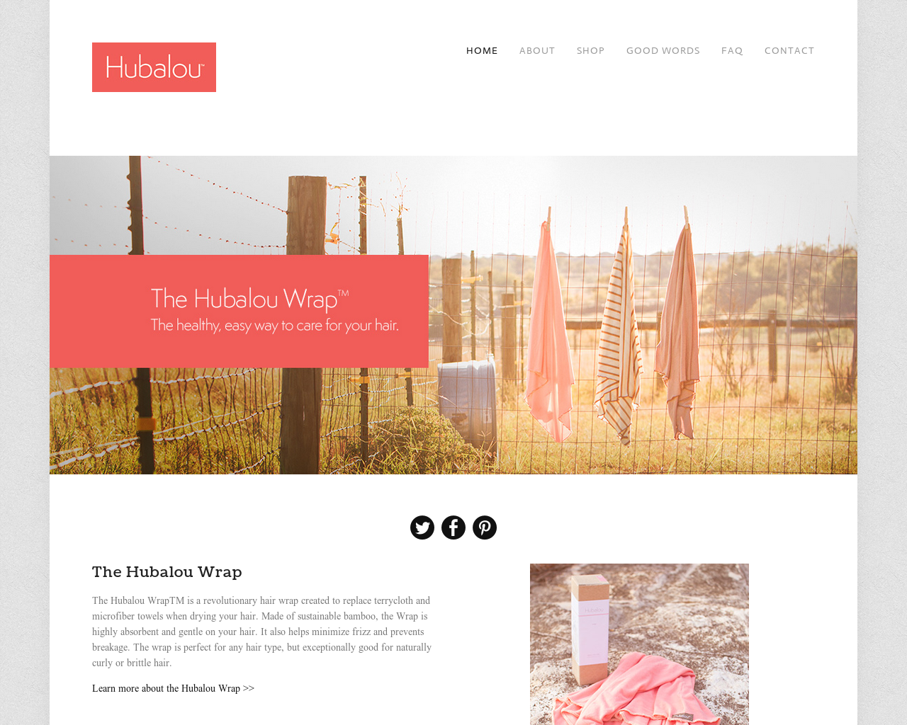
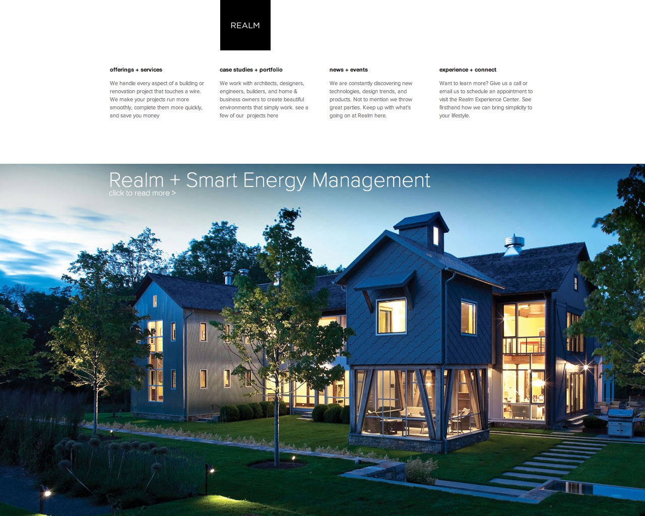
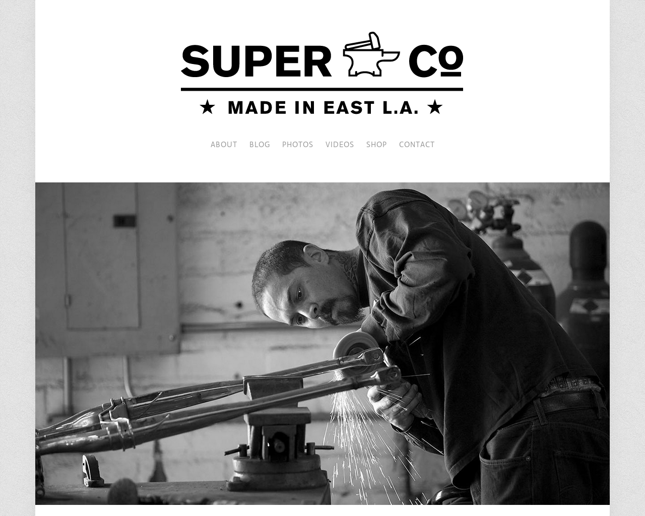
Dovetail is a versatile and stylish business template. It is easy to set up and welcomes visitors with thoughtful, modern layouts. Dovetail is popular with businesses of all kinds for its contemporary style.
Sizes & Values
Site Width – sets the width of the site content including canvas padding.
Page Description Width – controls the width of the page description when shown in the Page Banner area.
Canvas Padding – adjusts the amount of spacing around the inside edge of the canvas area.
Navigation Link Spacing – determine the amount of space set between each navigation link.
Header Padding – controls the amount of space below the navigation and site title in the header area.
Page Padding – sets the amount of space at the top (under banner area) and bottom of the page content.
Page Banner Height – determines the height of the page banner area holding the page thumbnail, title and description.
Footer Padding – controls the amount of space at the top of the footer area, below the top border.
Logo Height – sets the maximum height of the logo that is assigned to the site.
Social Icon Size – set the size of the (non-social-block) social icons.
Template Options
Header Alignment – controls the alignment of the logo (or site title) and navigation in the header area.
Footer Alignment – controls the alignment of the footer text and navigation in the footer area.
Page Borders – sets the thickness and display of the footer and page borders including horizontal rules placed with LayoutEngine.
Social Icons – controls the display of the (non-social-block) social icon links.
Page Banner Full Width – toggle the width of the page banner image between edge-to-edge and content width.
Hide Page Banner – disables the entire page banner area.
Hide Page Title – hides the page title inside the page banner area when enabled.
Show Site Info Icon – reveals an icon in the far upper right corner of the canvas that when clicked shows site info in an overlay.
Blog Styles
Blog Meta Color – sets the color of article meta information like tags, dates, author etc.
Blog Post Spacing – controls the amount of space between each blog post in list view.
Blog Sidebar Width – determines the width of the sidebar when displayed in a blog.
Blog Sidebar – controls the position / display of the sidebar within a blog.
Hide Blog Author – turns off the display of an author name within the blog post meta.
Show Category Navigation – shows category links at the top of blog pages.
Gallery Styles
Gallery Navigation – determines the type of gallery image navigation is provided on the page.
Gallery Info Overlay – select the type of display used for image title and caption.
Gallery Aspect Ratio – controls the aspect ratio (width:height) for the gallery active slide.
Gallery Arrow Style – determines the style of the arrows used to cycle through the slides.
Gallery Transitions – select the transition styles used to animate between slides being viewed.
Gallery Show Arrows – choose to use arrows for cycling through slides.
Gallery Auto Crop – choose to auto crop slide images to the selected ratio.
Gallery Autoplay – choose to cycle gallery images automatically without user interaction.
Gallery Loop – enable a gallery to cycle through to the first slide after the last slide.
Gallery Autoplay Speed – specify the speed at which the gallery pauses on the active slide.
Gallery Thumbnail Size – control the height of thumbnail images when used for gallery navigation.
Gallery Arrow Background – specify the color that is used for the shape of gallery arrows.
Gallery Arrow Color – specify the color that is used for the arrow itself.
Gallery Circle Color – specify the color that is used for the circle shape gallery arrows.
Gallery Info Background – specify the color used in the background of the image title and caption.
Product Styles
Product Background Color – sets the color behind the product image.
Product Overlay Color – sets the color of the overlay when product list titles are set to ‘overlay.’
Products Per Row – determines the number of products shown per line on the product list.
Product List Titles – controls the position of the product title on the product list.
Product List Alignment – sets the text alignment of the product title on the product list.
Product Item Size – select an image ratio for the product photo on the product list.
Product Image Auto Crop – determines whether product images fill the image area or fit within.
Product Gallery Size – select an image ratio for the product gallery on the product item page.
Product Gallery Auto Crop – determines whether product images fill the gallery area or fit within.
Show Product Price – shows the price on the product list page when enabled.
Show Product Item Nav – shows the ‘back to shop’ link on the product item page.
Show Category Navigation – shows category links at the top of shop pages.
Event Styles
Event Time Format – toggle between 24 hour or AM/PM for event times.
Event Icons – enable icons on the address and event time display.
Event Thumbnails – show an image thumbnail in list view.
Event Thumbnail Size – controls the size (ratio width:height) of the event thumbnail image.
Event Date Label – enable date overlay on top of event thumbnail.
Event Date Label Time – include the time of the event with the date overlay.
Event Excerpts – show optional excerpt text of events on the list view when present.
Event List Date – show the full event date (day, month, year) of the event on the list view.
Event List Time – show the time range (start time-end time) of the event on the list view.
Event List Address – show the event location address when present.
Event iCal/gCal Links – show links to add events to Apple or Google calendars.
Event Like and Share Buttons – show Squarespace simple like and share buttons on events.
Event List Compact View – enable a simple stacked view of events in the list view.
Event Calendar Compact View – enable a simpler calendar view optimized for smaller areas.
Show Category Navigation – shows category links at the top of event pages.


